Candlepower
Ad and marketing creatives
The Ündeniable Ümlaut
The English language has plenty of quirks, but accented letters aren't among them: no tildes, circumflexes, breves, or cedillas for us unless we're borrowing a word like "façade" or "doña." That dearth of diacriticals hasn't stopped quite a few brands from accessorizing their names with dots, slashes, and lines imported from other alphabets. In general, there's no linguistic rationale for the accents: they're simply sprinkled on logos like pepper on gulyás or cherries on Schwarzwälder Kirschtorte.
Of all the orthographic garnishes to be found among American brands, the most popular by far is the umlaut, the double dot that's common in German, Turkish, Swedish, and Finnish — and nonexistent in English. We can't help wondering: What's üp with that?

Languages with umlauts over consonants aren't unheard of, but they're rare. Usually, an umlaut appears over a vowel to change its sound. Indeed, "umlaut" means "sound shift" in German; the word was coined in 1774 by a poet, Friedrich Gottlieb Klopstock, and popularized in 1819 by Jakob Grimm, the linguist and compiler of German folktales.
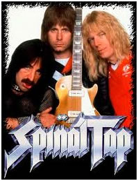
The heavy-metal umlauts were intended to make the bands seem more Teutonic and menacing. But Häagen-Dazs, the ice-cream brand founded in 1960 by a Polish immigrant to the Bronx — and bought by food giant Pillsbury in 1983 — had a friendlier goal. The name was invented "to convey an aura" of "old-world traditions and craftsmanship" — specifically those of Denmark, despite the fact that the name is meaningless in Danish (which lacks an umlaut) and all other Scandinavian languages.
This foray into "foreign branding," as advertising researchers now call it, was so successful that umlauts became almost de rigueur for the frozen-dairy market. Häagen-Dazs unsuccessfully sued one competitor, Frusen Glädjé, to stop it from using a Scandinavian marketing theme. (Spelled without the acute accent, Frusen Glädjé actually means something in Swedish: "frozen happiness.") Frusen Glädjé subsequently disappeared, but umlauted dairy-brand names proved to have staying power. Freshëns ("fuël for the body and mind") opened its first soft-serve-yogurt shop in Atlanta in 1985; Yogen Früz was founded in 1986 in Toronto and now operates in 25 countries.
The umlauted U offers a special advantage to brands: in logos, it can look like a smiley face.
Füd, a vegan restaurant in Kansas City, Missouri, and Güd, a new brand of lotions and hair products from Burt's Bees, also turn their logos into smiles — a long way, conceptually, from the threatening glower of Motörhead. For an even bigger semantic leap, you can't beat Söfft, a footwear brand (based in Greenwich, Connecticut) that stands for — well, softness, along with vague promises of "European design." The umlaut, like the double-f, is simply there to attract your eye.
European-ness is also the message of Seäsonal, an Austrian restaurant and "weinbar" near Carnegie Hall in New York City. "Seasonal" is an English word; the ä is a semaphore that announces the cuisine's provenance without, one hopes, affecting the pronunciation. (What would that pronunciation be, anyway? "See-eh-so-nahl"?) And Melōränge, a new variety of melon developed by a Dutch company, exoticizes its logo with an umlaut and a macron — neither of which occur in the Dutch alphabet.

The diacritical marks may make for spiffy logos, but they have a downside: they don't show up in the web address, and they're rarely reproduced in newspaper stories. Sometimes the brands themselves don't bother with internal consistency: Bed|Stü, a footwear brand meant to evoke New York's Bedford-Stuyvesant neighborhood (but based in Southern California's Ventura County) appears variously in web copy as BED|STU, bed|stu, Bed|Stu, and Bed Stu.

YogaMöm magazine's logo has not just an umlaut but a yin-yang symbol; thankfully, both symbols are absent in text.

While umlauts are the most popular way to give a brand name a little orthographic oomph, they aren't the only accent marks on the shelf. Børn Shoes, a brand of men's and women's casual footwear, has no apparent Scandinavian connection other than the slashed vowel: the brand shares a parent company with is Söfft. In Danish or Norwegian, "ø" is pronounced something like the "i" in "bird," but I've never heard Børn pronounced in any way other than "Born." As for its intended meaning, the company's website is mum.
Curiously, one rising brand with a legitimate claim to the umlaut has chosen not to use it. That brand is Uber, the on-demand car service currently serving San Francisco, New York, and six other cities. Although the name was clearly taken from German über — literally "over," and in US slang "very" or "really" — the company has chosen to Anglicize the orthography. In a world of gratuitous umlauts, that's uber-impressive.


